


.png?width=1470&name=SCS%20-%20Blog%20Template%20(18).png)
The Pantone Color of the Year is a color trend forecast intended for consumer products and designs created for clients. There are creative brands that renew their look every year according to the new color, although most businesses cannot handle that much change. It is also meant to be used for marketing and product creation, not so much with rebranding. You can create ads with the new color to give it a fresh perspective to the eyes of consumers. With the spread of online marketing and social media, the Pantone Color of the Year gains more and more recognition, thus creating the perfect opportunity for brands to incorporate it into their marketing campaigns.
Before 2019 ended, Pantone announced that its 2020 Color of the Year is Classic Blue, a shade reminiscent of the shy at dusk.
According to the Pantone Color Institute, it recognized similar feelings of instability gripping the whole world today. This shade offers the reassurance, confidence, and connection that people may be searching for in an uncertain global social environment. Classic Blue isn’t just beautiful to look at. It is also for all other senses to enjoy. The official Classic Blue scent is described in part as a “contemplation of where sky and sea meet”, the taste as “flowering vines”, the touch as a “soft velvety texture” and the sound as “vivid nostalgia”.
It can also be interpreted as having an earthy, floral musk; a sugary flavor evocative of blue raspberry syrup; the feel of a brand new, plush couch; and an underwater, ethereal sound.
Now you might be wondering how this color was chosen.
Pressman explains why the Pantone color of the year is so important. Each year’s color is decided through a long and thoughtful process that takes into consideration lifestyle and industry trends. These trends are typically the colors that reflect big macro trends that are taking place in culture. Cultural influences can come from art, upcoming media, movies, lifestyles, socioeconomic and political conditions, travel destinations, new technology – basically anything.
Additionally, the name of the color is also important.
Pressman mentioned that the name should resonate with the message that they want to get across. And true its name, Classic Blue can be regal, restrained, and boundless. More than that, it can also be edgy – even anomalous – utilizing a variety of tonalities, materials, and prints. Just think about a new-age, Classic Blue concept car.
As you can see, people are really serious about incorporating this color into their everyday lives. There are some that use Classic Blue accent pieces such as their scarf or watch strap. They also incorporate the same color of their houses, in a vase or candle. It can also be as simple as adding blue foods to your diet. Aligning with the growing emphasis on health, foods, and beverages that are similar in color to Classic Blue is rich in anthocyanin that are thought to bolster the body’s defense against ailments from cardiovascular disease, to cancer cell proliferation. Or you can just indulge yourself with a decadent blue macaroon. Yum!
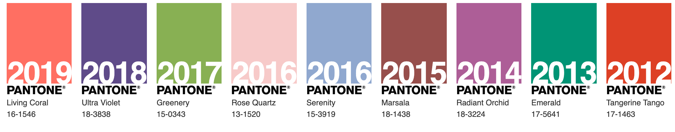
RELATED - 2019 PANTONE COLOR OF THE YEAR

.png?width=352&name=Copy%20of%20SCS%20-%20Blog%20Template%20(61).png)

