


Nothing could have ever prepared us for the chaos of 2020, that's why choosing Classic Blue as Color of the Year for 2020 is the very opposite of poetic justice. The Classic Blue shade reassuringly sent us off into a new decade full of uncertainty and turbulence, while calming us with a sense of confidence and connection which was meant to soothe people’s minds going into the new year. It was meant to inspire, helping to alleviate the natural fear humans have of an unsure future; a seemingly thoughtful choice in retrospect.
ESPN wrote an article last year about the 2020 Pantone Color of the Year and opened with this line: You can expect to see a lot of blue next year. Laurie Pressman, Vice President of the Pantone Color Institute even said “It’s a color that anticipates what’s going to happen next. What’s the future going to bring as we move into the evening hours?” And so, we did drift off into the dusky undertones of 2020.
Veering off from the turmoil this pandemic year brought upon us, this past week Pantone chose two colors for the year 2021, respectively:
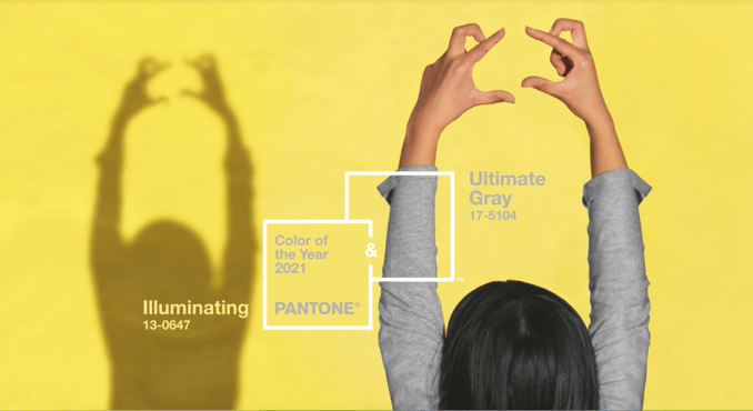
Ultimate Gray and Illuminating, a balanced blend of dull, dependable gray and the bright yellow of lemon skin.
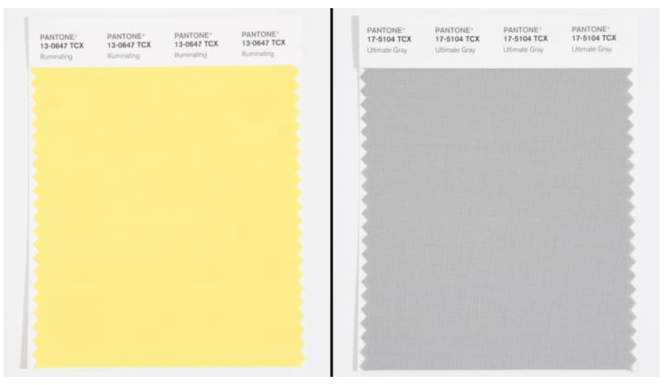
It’s the color of choice for the quarantine year where we had to insulate ourselves from the world and curl up in monochrome blankets at home, according to Leatrice Eiseman, executive director of the Pantone Color Institute. It is meant to evoke harmony as two independent colors come together to show how different elements can sustain each other – an all too familiar feeling as we move into 2021. The seemingly incoherent union of Ultimate Gray and Illuminating is hope, stability, strength and positivity - perfectly encapsulating steady familiarity with thoughts of a sunny tomorrow. With all the blues we’ve been experiencing for the past 9 months, it’s comforting to the human spirit to cheerfully embrace with this warm, joyous shade and ground that thought with calmness and composure. We all know we need to bolster ourselves and press on despite everything.
The Conversation on Color
Pantone is mainly known for color forecasting and trend reports, but it expresses the goal of striking a conversation about color. A primary concern they have is with what colors mean for people psychologically or emotionally in any given period, and how it evokes certain feelings out of them. Deciding on what color/s to incorporate is largely influenced by the current global milieu, and it cannot the overwhelming impact of the pandemic is much apparent in choosing this year's Color(s) of the Year.
Color Psychology
Pantone contemplated optimism and vivacity in choosing Illuminating, while Ultimate Gray gave off feelings of composure, steadiness and resilience. According to color associations made by Eiseman, the feeling of "cheer" and "happiness" is most attributable to yellow since it is the color of the sun.
On the other hand, the selection of Ultimate Gray, according to them was a tad more complicated as opposed to its partner color this year. Qualities of fortitude and reliability enter the mind, since it is the color of stone, often hard and pressing but can ultimately be relied upon. Gray is most often correlated with negative feelings such as sadness, fear, and disappointment and that we couldn't think of any better way to describe what we just experienced this past year as sickness and economic turbulence set in. However, this can be off-set with the idea that gray is versatile even in its neutrality.
Conclusion
This marks only the 2nd time in Pantone's history that two colors were chosen. We could interpret the union of these colors in numerous ways, but the most striking one is with bringing in these two colors together it highlights our innate need to band together when times get rough. This year taught us that collaboration with other individuals equates to strength and hopefulness.
Pressman and Eiseman wanted to showcase that there is strength in solidarity and joy comes when we rely on each other. The former added that, "I think (one) thing that's become abundantly clear during this time...across the world is this deeper understanding of how much we need each other, how our connections to other people, our relationships with other people, give us that emotional support."
It is rather comforting to know that you are not alone in this world, and a bit of dullness can be just as vibrant when we come together and Illuminating perfectly exemplifies just that. Lastly, as we look for normalcy more than anything else, a shade like Ultimate Gray is only fitting.
CHECK OUT OUR ALCAS SUCCESS STORY

.png?width=352&name=Copy%20of%20SCS%20-%20Blog%20Template%20(61).png)
.png?width=352&name=SCS%20-%20Blog%20Template%20(18).png)
