


We are surrounded by a million words, phrases and sentences every day that we glance at and register subconsciously. Companies try their best to catch your attention with their ads and convince you to try their product with flowery words and catchy phrases. It all happens so quickly that you may have not even thought about what underlying factors are influencing us.
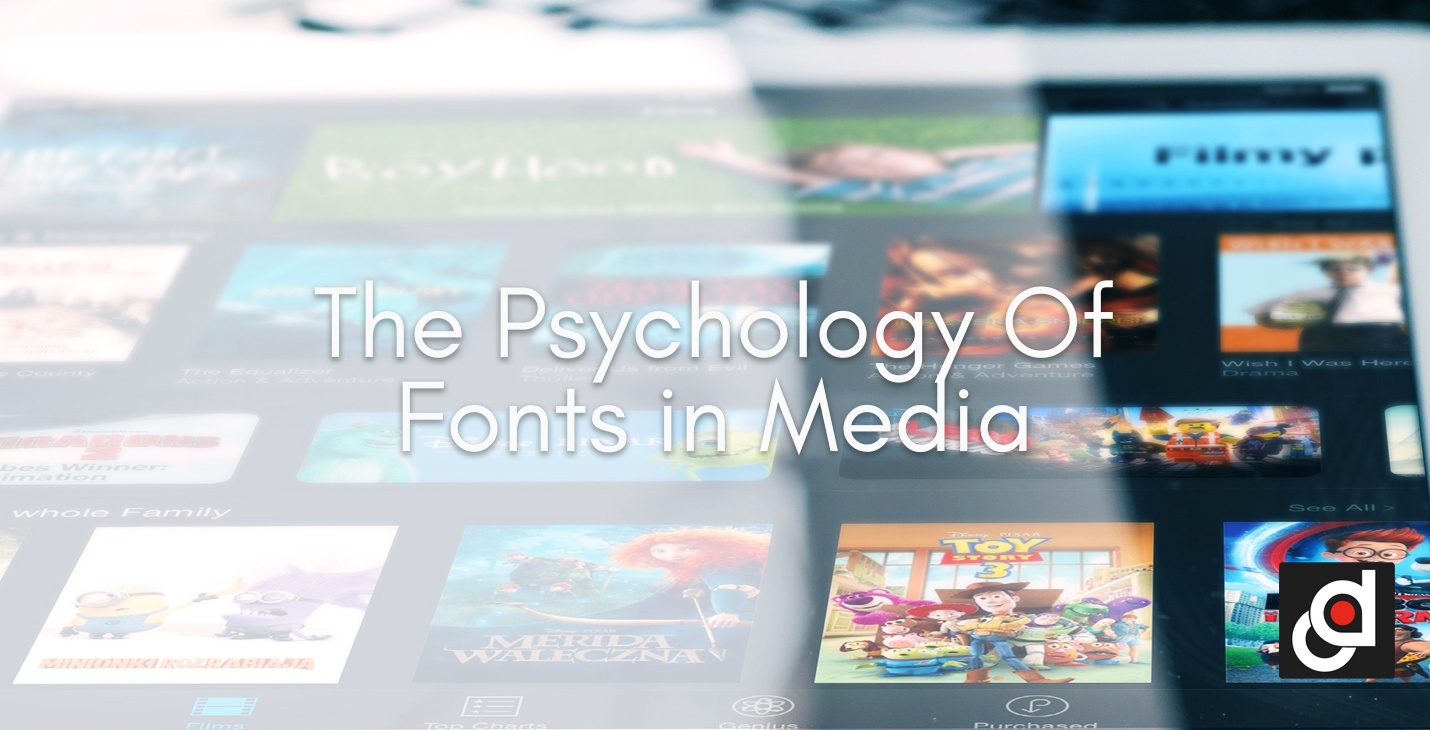
After a long and tiring day of work, the best way to de-stress is probably by binge watching that new tv show on Netflix or Hulu. But what do you do when you’ve already watched all of those shows? Well, most people skim through selections until they find something interesting to watch. We never really realize this, but a show’s title in some way is what grabs our attention. The trailer may entice you but a show’s title is usually one of the first things you look at. Why? It’s a psychological reaction within us to assess a show or series of its value and interest. We often hear to not judge a book by its cover, but in the marketing world, the proof is in the design because there's a lot of power in a logo.
There was an idea called color psychology, which is when fonts and emotions are related. The premise of font psychology is similar to that aspect that each font can elicit a certain emotion or steal your attention. This means that when it comes to logo, you should carefully pick the color and font for your design. Fonts can subconsciously influence your viewer's imagination, mood and expectations. What is even more peculiar is the fact that fonts may possibly also have a physical effect on people. Sarah Hyndman, a long time graphic designer and public speaker, spoke profoundly about fonts and its influence on our perception of smell and taste. She elaborates that we tend to associate certain fonts to everyday things. For example, fonts like San Serif and Comic Sans look more rounded are linked to fruits and can possibly evoke hunger.
RELATED: HOW TO PICK THE BEST COLOR FOR YOUR LOGO
You should plan and decide first what font to use even if it may seem arbitrary. There are a lot of fonts to choose from and it may be a bit challenging to choose which font does fit for your market. To make it easy, you should first know who your target audience is and what your identity as a market is too. Next, be diligent enough to scout how your competitors are using their fonts and look for similarities and trends and then find a way to stand out from your competitor’s fonts and styles. Lastly, you should be aware of font chemistry and this means that the body of the text should be easily readable and complement your header or title.
Fonts alone aren’t going to completely convince a person, and font psychology is not an exact science at all. There will be derivatives and not every font will have the expected desired effect. This only aims to help and increase the chances of your market to stand out and be acknowledged as a brand of your own.


.png?width=352&name=Copy%20of%20SCS%20-%20Blog%20Template%20(48).png)
.png?width=352&name=Copy%20of%20SCS%20-%20Blog%20Template%20(47).png)